


We were approached by Tic Toc Games who was seeking to redesign their UI to better match the quality and overall look of the mobile game.
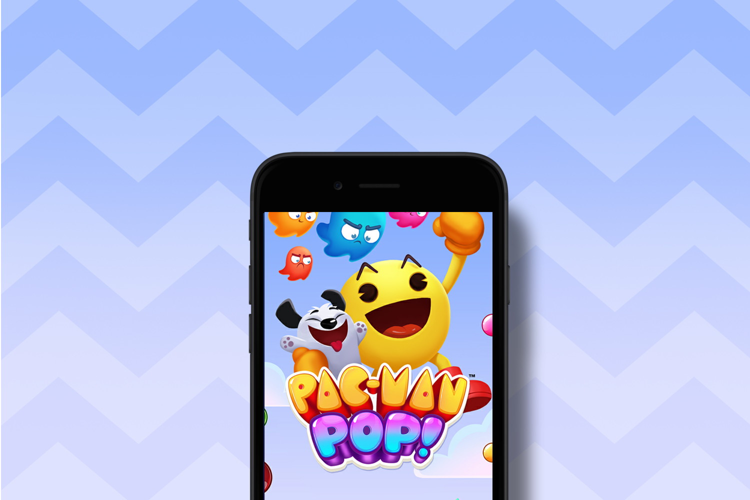
We were approached by Tic Toc Games to redesign Pac-Man Pop’s UI to better match the quality and overall look of the mobile game.
We wanted to echo the fun and friendly essence of BANDAI NAMCO’s Pac-Man. Therefore we strategically took on a palette that would help Pac-Man and other vital information stick out.
We created a rounded shape language and darker blue color palette so we could mimic the retro colors of the original arcade game, and distinctly distinguish the UI from other art assets in-game.
The assets XAMA created distilled the Pac-Man brand to look interactive but still playful. Designing multiple active states allowed for the developer to quickly implement the new look as well.